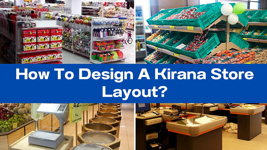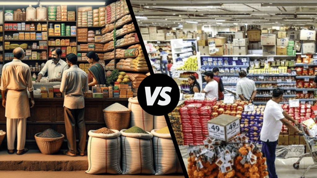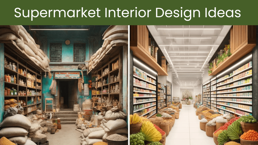
In Indian retail, Kirana stores are a very important part of everyday life and design an effective Kirana store layout is crucial to optimise customer experience, increase sales and ensure operational efficiency.
In this blog, we will discuss important concepts and techniques in two steps to help you design a Kirana store layout that satisfies both the functional and psychological requirements of your customers.
STEP 1
Understanding of Customer Behaviour: Understand customer behaviour in a kirana store before you start designing a layout. Convenience, quick access to necessities, and a familiar shopping experience are all things that customers in these stores look for.
Consider the following tactics to satisfy these preferences:
- Well-Lit: Make sure your store is well-lit so that the products are clearly visible from a distance as well and enticing enough for customers to make a purchase.
- Product Exposure: Put products in plain sight so that clients may find what they need easily. Additionally, it will promote impulsive shopping.
- Mobility: Keep the aisles and pathways large enough to allow for simple mobility and trolley movement.
STEP 2
Plan Store Layout Strategies: Now, let’s delve into specific strategies for designing the layout of your kirana store:
- Plan a Logical Flow: Create a path for clients to follow in your retail layout. Because most consumers go in a clockwise direction i.e. left to right, think about placing high-demand items close to the entrance.
- Group the Categories: Combine similar products. Put all the dairy products in one area, the cleaning supplies in another, and so on. Customers will find it simpler to find what they need as a result.
- End-cap Displays: Utilise end-cap displays to highlight promotional goods, new products or for festival product promotions. These are the one of the most valuable spaces in a kirana store and can greatly increase sales.
- Eye-level: Popular and higher-margin items should be displayed at eye level since customers are more likely to see them there.
- Cash Counter: Make sure the billing area is organised and well-marked to provide a simple transaction. To encourage impulsive purchases, place small, alluring objects like chocolates or razor blades close to the cash counter for impulse purchases.
- Offer and Promotion Section: Create sections for bulk supplies and products that are on offer or being promoted. These can attract customers and increase sales.
- Labels and Signage: For product categories and pricing, use labels and signage that are clear and simple to read. It increases clarity among the customers and helps in sales.
- Shopping Trolleys/Carts: Provide shoppers with shopping carts and baskets near the entrance so they can enter the store with it. This promotes more purchases.
KEEP IN MIND
Adapting to Seasonal and Local Needs: Don’t forget that the layout of your kirana store may need to change seasonally or based on local preferences. For example:
- Seasonal Displays: Decorate your store to align with holidays or seasons, creating a festive atmosphere that attracts customers.
- Local Preferences: Pay attention to local preferences and trends. Stock products that cater to the tastes and needs of your specific customer base.
Conclusion
The layout of a kirana store must carefully combine convenience, usefulness, and attractiveness in order to optimise the consumer experience. You may design a store that not only increases sales but also nurtures customer loyalty by comprehending customer behaviour, putting efficient layout methods into practice, and putting customer comfort first. To succeed in the retail sector over the long run, keep in mind that flexibility and adaptation to shifting customer wants are essential.
Tap into the potential of your business by getting in touch with Kirana Friends. You can connect with a Kirana Expert by calling or messaging us on 8010442222.
You can also download the Kirana Friends Application from the Google Play store by clicking on the link below and learn how to run your store more profitably.


