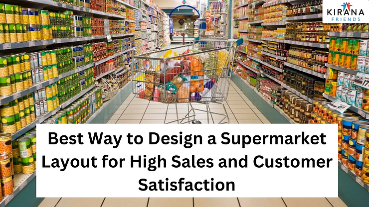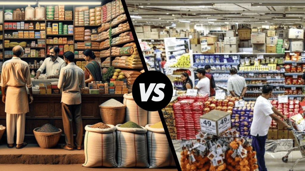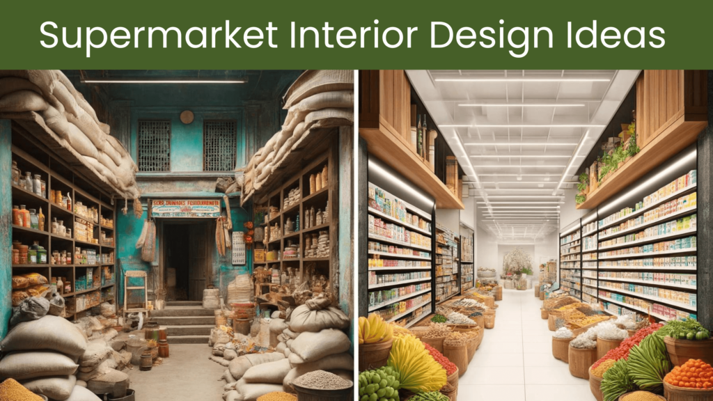
The layout design a supermarket plays a crucial role in shaping the overall shopping experience for customers and enhancing the overall efficiency of the business. When Starting with a new supermarket or renovating the existing one, it is vital to create a layout that caters to the specific needs and preferences and promotes customer convenience thereby enhancing the overall profitability of the supermarket.
Some Benefits of Having Correct Store Layout –
- Increase Customer Satisfaction.
- Encourage Impulse Buying.
- Maximum utilization of store space.
This article will provide a step-by-step guide for design a supermarket, focusing on elements such as entry and exit points, cash tills, display racks, refrigerators, and, displays for offers and promotions.
Step 1 – Store Plan Evaluation
The First step in designing a Store Layout is considering the store plan which defines the overall structure of the store. Consider all the elements such as entrance, columns, and any other structure that may exist or is planned
Step 2 – Plan the Customer Flow
The entry and exit points of a supermarket serve as the first and last impression for customers. In supermarkets, it is important to ensure a clear and easily accessible entrance to accommodate high footfall when experienced. Wide aisles and doors can help facilitate a smooth flow of customers, particularly during peak hours. Additionally, placing attractive promotional displays near the entrance can grab attention and appeal to the customers to explore the store further. It is highly recommended to –
- Create an entrance facing the roadside place from where customer entry is easiest and store entry most visible.
- A common entry and exit point should be provided Unless the store is approximately 5000 sq ft and above.
Step 3 – Provision for Cash tills or check our counters
While designing the store layout it is crucial to efficiently plan the cash till placement for ensuring a smooth checkout process, Especially If your store size is large and witness heavy customer traffic, during weekends and festivals. To promote less waiting time and high customer satisfaction, it is recommended –
- Allocate a sufficient number of cash tills. Ideally, one till is required for every 5000 bills generated every month.
- Organize the cash till/s in such a location and direction that after billing, the customer lands at the exit of the store.
- Adequate signage and queue management systems can further enhance overall efficiency and customer satisfaction.
Step 4 – Placement of Display Racks
Placement of Display Racks can significantly influence product visibility and customer buying behavior. In supermarkets, where a wide range of products are available, categorizing the products, determining the flow, and using racks and shelves that would best accommodate those products are crucial. Follow the points given below for effective placement of racks in your supermarket-
- High-quality racks should be used all along the walls in the areas before the tills.
- Use racks to create display space and aisle in the open spaces between the walls. The direction of the racks should create open aisles and not block customers’ view or movement when they walk into the store.
- Towards the inner ends of the store provide space for Dump Pallets for groceries and other Non-food items.
- There should be sufficient space for customers to move around the (aisles minimum 3 to 5 feet).
- End Caps can be used to promote impulse purchases.
Step 5 – Placement of Refrigerator
While planning the placement of fixtures in your supermarket determine the spaces where the refrigerators will be placed. Refrigerator placement is very important for supermarkets because a variety of perishable food items are sold. It is highly recommended to place the refrigerators either towards the entry-exit point or at the inner corners of the supermarket so that these products generally being highly perishable, can find a place at the top of the baskets or trolleys.
Step 6 – Dedicate Space for Offers and Promotions
Offers and Promotions can act as a great medium for attracting and retaining customers in your supermarket. A space within the supermarket should be dedicated to bringing products on offers and promotions to your customer’s attention. Ideally, these spaces should be near the billing counter or the entry and exit point of the supermarket. The placement of these products should be in such a way that their visibility is free from any hindrances and obstacles.
An effective Supermarket Design requires careful consideration of various factors to enhance customer experience and operational efficiency. By increasing ease of navigation, making checkout processes effortless, and creating visually appealing displays, supermarkets can provide a pleasant and convenient shopping experience for their customers.
Ultimately, a well-designed layout contributes to customer satisfaction, increased sales, and long-term success in the competitive supermarket industry. Supermarket Layout Design play a vital role in the success of your business. Get an Expert’s opinion on the Layout of your Supermarket by connecting with Kirana Friends. To get in touch Message or call us on 8010224444.
You can also download the Kirana Friends Application from the Google Play store by clicking on the link below and learning how to run your store more profitably.


